As a professional graphic designer and template builder, I am always searching for inspiration when creating new designs for clients as well as my own business. You can honestly find inspiration anywhere, originality is the key to standing out from the crowd. Your buyers need to be wowed and have a good reason to choose you over the competition. A unique eBay design listing template with personality is one way to grab their attention.
In a previous post, we explored “the anatomy…” which focuses on getting your structure right, the bare bones of an eBay listing template. Here I would like to dig a little deeper into how I personally draw inspiration from something as simple as your logo or the product category you are selling in to give a listing a unique colour scheme and feel. In addition, I will walk you through using a great tool inside of CrazyLister to help you create awesome graphics that will really give your eBay design its own unique personality.
In this post we’ll explore:
- How to take inspiration from the colours in your logo to create a colour scheme for your eBay template.
- How to layer elements in your listing to create an eye-catching header image that will communicate your product offering.
Gaining inspiration from a great logo
When working with clients, the very first opportunity I get to gain inspiration and learn the direction of the eBay design, namely the colours used in the design, comes from the company’s logo. A great logo is really all you need to get the ball rolling, and it can really set the tone for the whole listing. Getting started with your eBay design is always the toughest challenge. Once you’re inspired, choose your colours and decide on what exactly you would like to communicate with the design. I do this every day and still face the occasional mental block. Let me show you how I get the creative juices flowing, starting with just a logo.
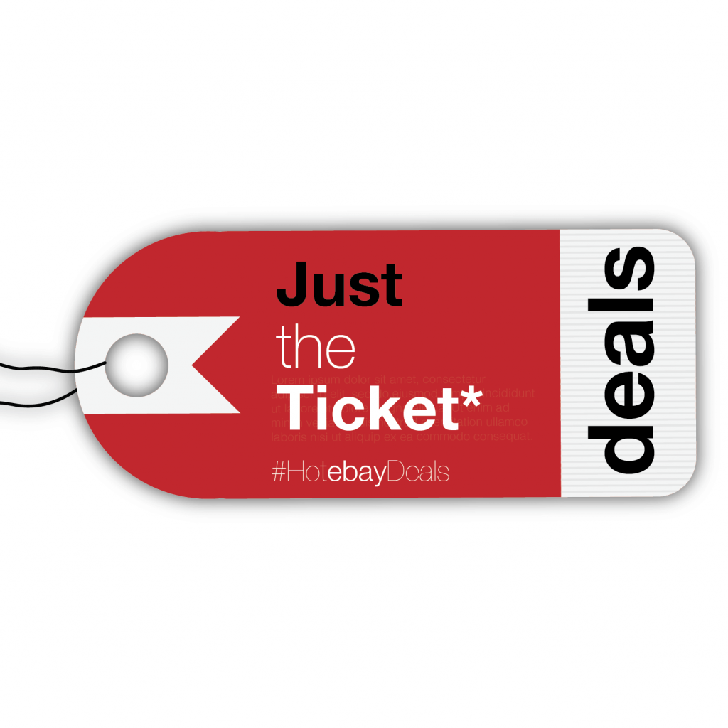
ebay design logo example
A well designed company logo is a must. Regardless of whether you’re a beginner or a seasoned eBayer, make sure that yours really pops. It can communicate so much to your buyers and really helps you build a great brand through design.
Okay, so we have pretty cool, general logo for an eBay store above. At the first glance, the simplicity of the logo is not necessarily a great source of inspiration. I love working with logos with a little more complexity, more colours, fonts, icons and so on. But do not let the simplicity fool you, we have a strong colour to work with and that is exactly where we’ll begin.
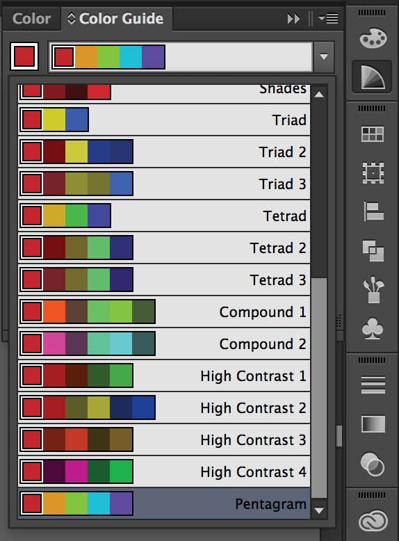
Using the main colour as my guide, I am able to draw out two very different colour schemes that will give my templates a completely different feel.
 |
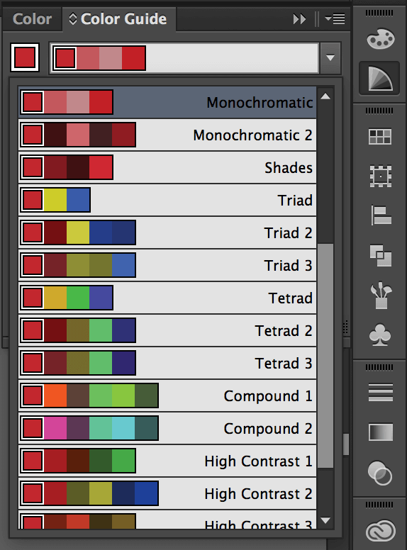 |
| Pentagram Colour Scheme | Monochromatic Colour Scheme |
I personally use the Adobe Creative Suite to explore colours, although there are many resources out there that can get the job done.
pinterest is a fantastic source of inspiration, especially when looking for colour schemes! Search the web for a colour scheme you like the look of then apply the selected colours to your listing by pasting the ‘HEX’ reference or ‘RGB’ values into CrazyListers colour picker. It’s that simple.
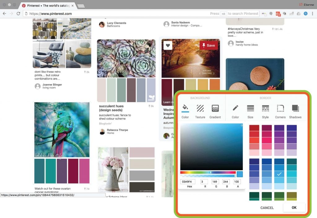
easily choose the color you in crazylister
Try CrazyLister for free! Easily create professional, mobile-optimized eBay listings
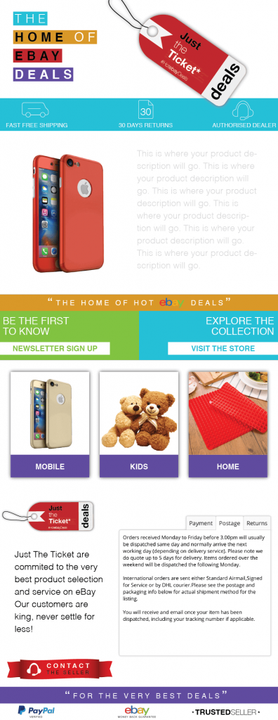 |
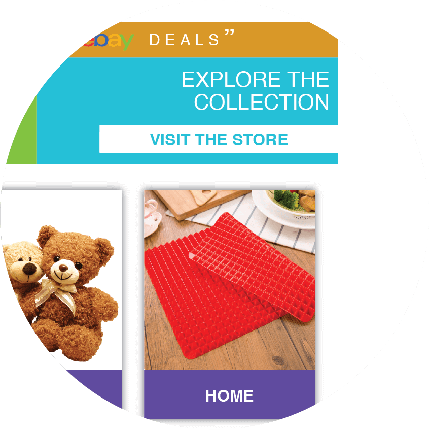
Bright, vibrant and suitable for a varied product range the colours You do not have to start from scratch every time but as you can see the resulting template has its own unique feel. |
By using the main colour in the logo to generate a ‘Pentagram’ colour swatch, I am able to use my chosen five colours to create a bright and vibrant general template that works well with a wide range of products. CrazyLister’s colour picker makes it very easy to input the exact colours I chose to build shapes that will form the template’s structure.
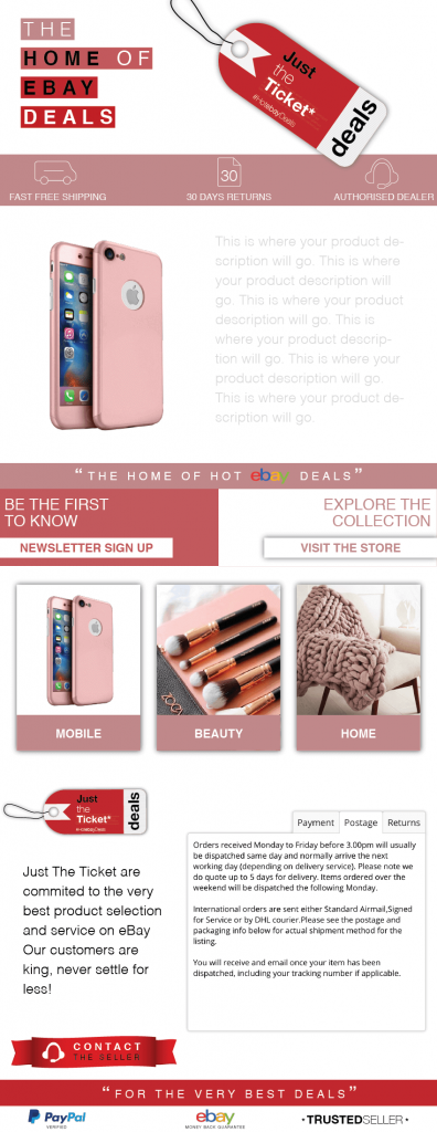 |

Soft tones give the template a feminine feel, which is reflected in the product categories |
For the second variation of the template, we will use the main colour in the logo again, but this time applying a ‘monochromatic’ swatch of colours. This allows us to create a more feminine theme that suits a different product selection aimed more at the female orientated categories. By duplicating the original template, adjusting the colours to the new swatch and replacing the three images in the middle of the template (hyperlinks to categories) I am able to create a brand new template without much effort. The same would apply for male or kids orientated product categories and save you the time of designing new template from scratch.
Adding Images that represent your product category to your header
 |
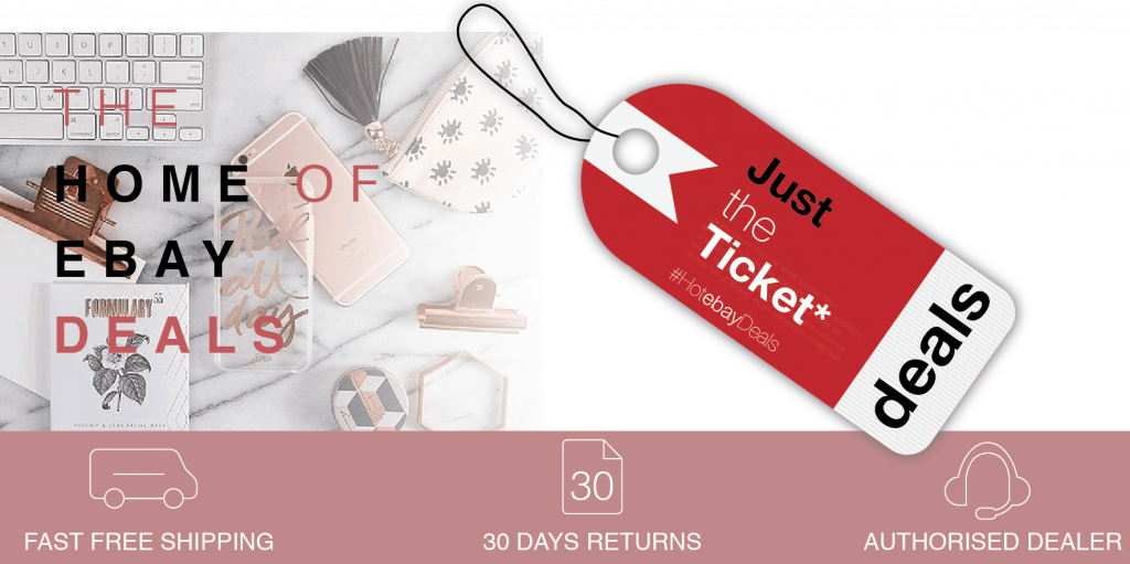 |
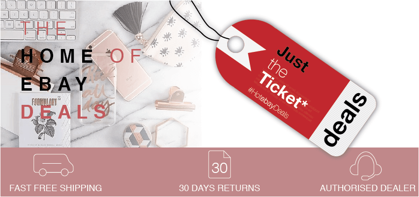
In the two examples above, I have simply added a background image(s) and additional images to the header. This further enhances the theme of your eBay design and communicates to prospective customers what they can expect from your listing and product offering.
This is done through layering the multiple elements placed in the template and playing with the position to get to the desired result. Let’s explore how this is done by using the “arrange tool” inside of CrazyLister.
 |
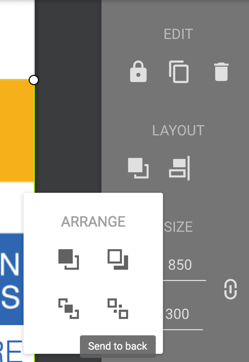 |
The ‘arrange’ tool is located under LAYOUT in the toolbar TO the right hand side of your screen. You have a number of options that will allow you to move objects above and below one another till and into the desired position. Simple and easy for you. The header below is made up of five separate layered elements.
 |
Below is an outline of how the elements are layered to achieve the desired result.
 |
Layer 1 – Photo |
 |
Layer 2 – Shape |
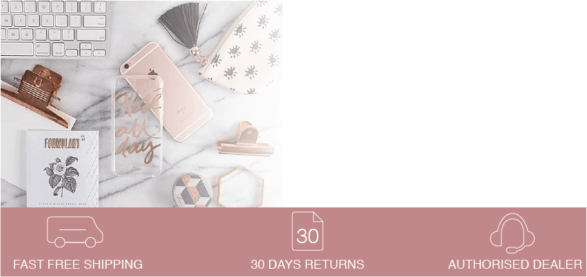 |
Layer 3 – Icons |
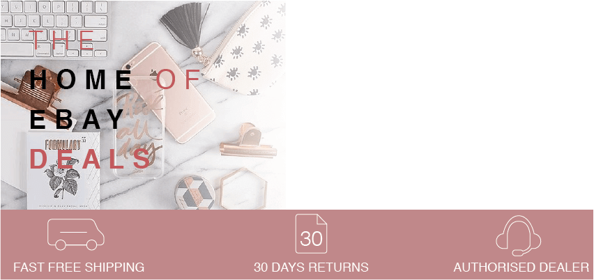 |
Layer 4 – Text |
 |
Layer 5 – Logo |
It may seem complicated, but I can assure you that it is very easy to do in practice. Get the hang of arranging elements in your template and you’ll take the designs to another level.
To conclude
So there we are guys. I hope you found the tips useful. Get inspired from something as simple as your logo. You can take colours or even shapes from it to get the creative juices flowing. Explore colours and see how applying different ones can change the feel and theme of your templates.
You don’t have to start from scratch every time, duplicate a template and edit the colours to save time when listing and keep your designs consistent. Finally, to give your eBay design the wow factor, I recommend getting the hand of the great editing tools inside of CrazyLister to create ever more creative, professional designs.
Take your time, work hard step by step and you’ll soon be creating fantastic templates that far will outshine the competition.
Good luck.
Guest author: Etienne Amion
Etienne Amion is the founder of Studio8ight (Professional graphic design services for e-commerce and eBay businesses). Based in London, UK.
The only thing I love more than e-commerce is great design.


