Victor’s comment: I have previously written about a decade-long study conducted in the UK, which measured the effect of design on sales –
In 2005, a group called The Design Council studied 63 companies that publicly traded on the FTSE (Financial Times Stock Exchange) over the course of a decade.
They discovered that companies that focused on design did substantially better than the ones that didn’t – they outperformed the FTSE 100 index by 200%.
In this post – Etienne (a professional eBay template designer and a veteran eBay seller) is going to share effective eBay listing design insights he learned from the 100’s of projects he worked on.
Let’s dive right in –
After building 100’s of templates for clients as well as for my own eBay business, it’s fair to say I’ve gotten pretty good at this. Don’t get me wrong I was horrible at the beginning but as they say ‘practice makes perfect’.
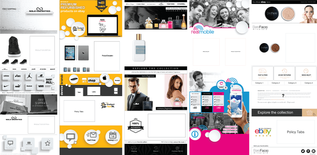
ebay listing designs created with crazylister
Now I have it down to a fine art. A double espresso and a spark of inspiration is all I need to get started. Thousands of hours have gone into deriving a formula that works. Unique, visually appealing, mobile optimized templates that increase conversion rates is the goal.
Condensing what is certainly thousands of hours of template building into simple steps you can learn from and apply to your own templates, thus showcasing your products in the best possible light and translating them into a more profitable, professional eBay business.
“Think of it as looking over my shoulder”.
Each client or product and product category carry with them a unique approach and design, but I can tell you that there are elements that, in my professional opinion, all templates must contain. Let me walk you through them.
In this blog post, you’ll learn
- How to structure your template.
- The essential components that make up a successful eBay listing design.
- The CrazyLister toolbars and how they will assist you in building your eBay template.
Building a professional eBay listing design the right way
Take a look at the template below. Together, we will reverse engineer it into its individual components. This was no happy accident. Each ‘panel’ is carefully drafted, designed and positioned to sell! Its components form panels, we’ll start with an overview then delve a little deeper into the key details.
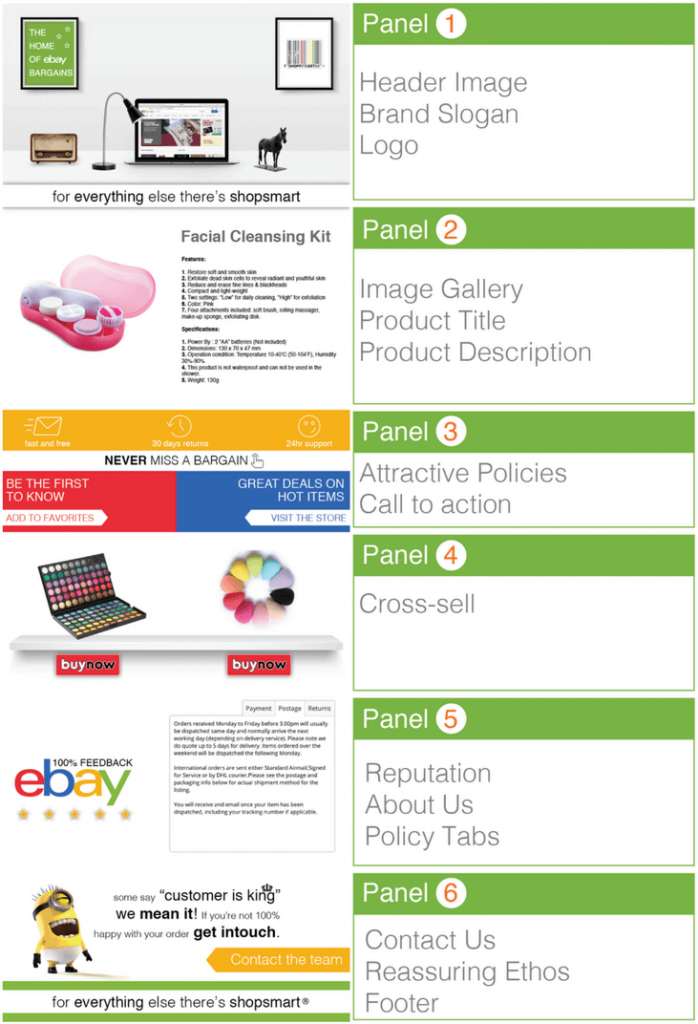
perfect eBay listing design
Intro
As both an avid buyer and seller, I always place myself in the shoes of a buyer and think about what I would like to see, and what would convince me to make a purchase.
Once again, this is not always the lowest ticket price, this is an eBay myth I have seen disproved time and time again.
Perceived value is how most buyers make a decision. Show your customer that you are professional, reliable (check out our eBay tips about essential trust signals), have a great quality product and excellent customer service and they’ll be more likely to choose you over the competition. The structure of my eBay listing design is built with this in mind.
Now let’s break it down.
Panel 1 – first impression
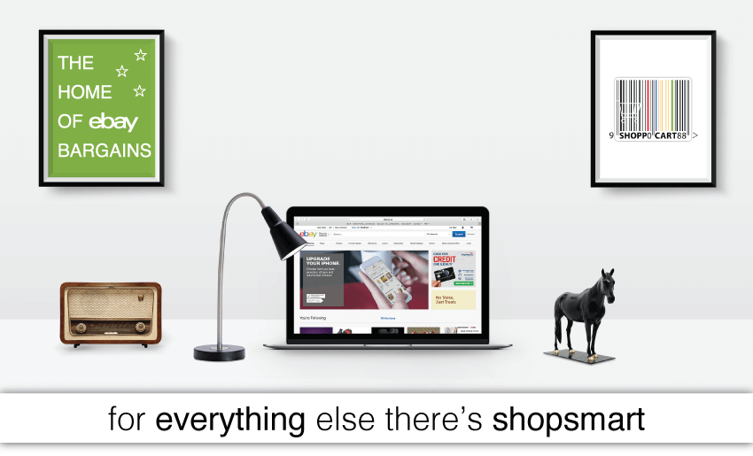
ebay listing design – panel 1
Your first panel is all about establishing your brand. Making a great first impression. I choose to communicate professionalism and an eye for detail.
If I’m willing to make such an effort with my branding, I believe my customers will understand that I will take care of their orders with the same attention to detail.
Both your logo and tagline support the message you aim to communicate so make an effort and believe me you’ll be rewarded.
In this example, both the visual and tagline suggest a varied and quirky product range and, of course, a cool logo is a must.
Try CrazyLister for free! Easily create professional, mobile-optimized eBay listings
Panel 2: showcasing the product
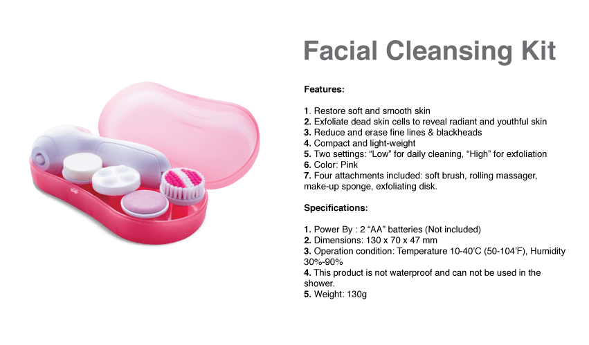
You don’t have a proper listing without a good quality image gallery and a well-written, concise product description. For some great tips on how to take good pictures for your eBay listings please check out the dedicated post I wrote.
Now, if we’re talking product descriptions, less is most definitely more. I like to get to the point and use bullet points wherever I can.
Your buyer usually knows exactly what they’re looking for and paragraphs are just going to put them to sleep. Communicate as much as you can with photos and graphics, don’t talk yourself out of the sale and always, always write original content. Copy and paste tactics with anything on eBay is never a good thing and in just a few minutes you may write a far better description than the competition to secure that all important “khaching”!
Try CrazyLister for free! Easily create professional, mobile-optimized eBay listings
Panel 3: create urgency

ebay listing design to create urgency
Ok, now it’s time for a Pro tip! I’m pretty sure that it’ll no longer be a secret once this post goes out. Panel 3 can really speed up a buyer’s decision.
As a buyer, you’ve been convinced by the branding, wow’d by a gallery and great product images and know exactly what you’re buying with a sharp product description. The last bit of info you need to know is what is going to happen once you click the ‘buy now’ button:
- Extra postage costs?
- How long will it take to arrive?
- What happens if I don’t like it?
All this information is delivered in a few simple graphics. My theory is that, for most buyers, this is enough to win their business, and just in case they’re not ready to buy, I also make it easy for them to ‘add me to their favorites” and ‘visit the store’ if they’d like by linking the text to the relevant eBay page.
Setting up links with CrazyLister – 4 Simple Steps
- Select the graphic, photo or text you would like to turn into a hyperlink.
- Click the ‘link to’ icon in the toolbar above the template window
- Paste the url you’d like the link to point to.
- Click ‘update’ and you’re done!
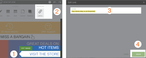
adding links in Crazylister
Panel 4: cross sell
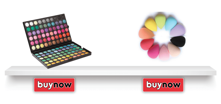
ebay listing design – cross sell feature
Now let’s talk about the fourth panel. Bear in mind that this panel will require some ongoing maintenance (for example, replacing images if you choose to link different listings). I have placed two hyperlinked button graphics pointing at other listings in my store. This panel is made up of a backing image (shelves), images of the products and the two buttons. Simple and easy to put together, but very effective if you choose the right selection of products. Choose products within the same category, a set of products you believe the buyer might be interested in purchasing together.
By the way, CrazyLister offers a free cross sell gallery, compliant with all eBay’s new policies, which you can apply to all of your listings in seconds.
Panel 5: information tabs
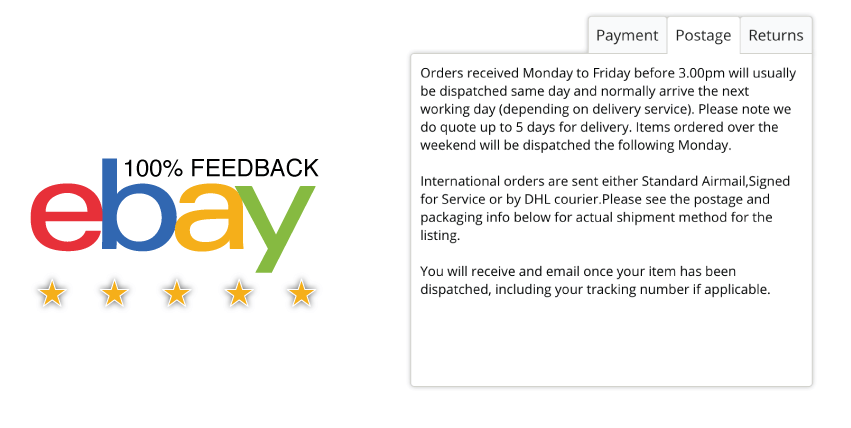
ebay listing design – tabs
As we are getting to the end of the listing, the fifth panel is there to give more details on policies and your reputation.
I always use tabs to really make the most of the limited space I have.
No customer wants to scroll through paragraph after paragraph of boring policies and, more often than not, they will never read through your policies unless there is a issue after the sale is complete.
I would also recommend shouting about a great reputation here. If you are a top rated seller, have great eBay feedback or have sold an impressive number of units, don’t keep it to yourself, be proud and share it with your customers.
Alternatively, you could also include an ‘About Us’ section here to tell the story of the store or share your ethos.
Panel 6: make it memorable
Finally let’s talk about the last panel, the footer. I like to leave customers with something to remember me by. I have to admit, I like to make this footer is a little fancy. With that in mind, there are a few things I believe you must include here.
Include your tagline or logo once again so your customer remembers you and also include a ‘contact us’ section.
If a great template hasn’t convinced your buyer, you need to know why. The ‘contact the team’ hyperlink makes it easy for my buyers to ask me anything. Honestly, you’ll be surprised by what you learn when you make it as easy as possible for buyers to contact you. If there is an error in your listing, an issue with a delivery or even if you simply missed something out of the listing, a customer inquiry can be the quickest way to spot a problem. Then you can quickly improve the listing and make more sales!
Conclusion
We all know that you have to get customers to your listing in the first place with optimized titles and a great gallery image, but a well-structured, well-designed listing template is worth investing time in and will be sure to pay off as your business grows.
Don’t get me wrong, it takes a lot of trial and error and you will need to learn a few new skills, but don’t let this scare you. This is one area of your eBay business that can really make all the difference to your sales and is well worth your time.
Once you break things down into their individual components, you’ll find it much easier to get the hang of. Work on one panel at a time, mastering each panel in smaller manageable chunks. You will find yourself powering through great looking, functional templates like the pros in no time. Be sure to utilize the CrazyLister toolbar and tutorials as they are fantastic.
Happy Template Building !
Guest author: Etienne Amion
Etienne Amion is the founder of Studio8ight (Professional graphic design services for e-commerce and eBay businesses). Based in London, UK.
The only thing I love more than e-commerce is great design.


