What is an ‘About Us’ page and why is it so important ?
The ‘About Us’ page though very typically overlooked is a critical pivot of your eCommerce business, be it an independent website or as part of an online marketplace such as Amazon. The reason why the ‘About Us’ is so crucial is that it is the face of your business, the story behind your product.
When you own a bricks & mortar store, you are able to greet customers face to face and let them know what makes your product unique. With eCommerce, we have lost that ability and must build a narrative for our brand with the tools at our disposal. One of the key tools is an ‘About Us’ page.
The three things you want to earn from people are their:
- Trust
- Awareness
- Respect
Once you have done that, you are more likely to turn a visitor into a shopper. Consider the following data:
For folks who never gave their ‘About Us’ page too much thought, these two statistics may very well change the way you perceive this seemingly marginal element and motivate you to really invest time, effort and thought into the page which greets your potential customers.
In this post I will explain:
- What elements are crucial to include in your ‘About Us’ page
- Give examples of fantastic ‘About Us’ pages which are bound to inspire you
- Share some tips of ‘About Us’ page generators for those of you who simply don’t have the time or energy
Elements which are crucial to include in your ‘About Us’ page
Now that you understand how important it is to have a memorable and impressionable ‘About Us’ page. I would like to share the notes which are important to hit when building this part of your site:
- The narrative – Beyond buying a product, people want to buy into a story. That is why consumers are willing to pay exorbitant amounts for brand name items. Customers want to feel that your product is unique and that by buying from you they themselves will essentially become a part of your narrative. Think of a billboard with a gorgeous man and woman driving a convertible – most people want to be part of that ‘story’ and therefore their desire to own said car increases dramatically.
- Visual stimulation – This can be pictures of the staff and workers which shows shoppers that your business is run by real people who they can relate too. Especially if your warehouse or offices are located in America, many people want to support businesses which create jobs locally. You can also add pictures of your products but in this case I think pictures of people are more effective as product pictures can already be seen in the item listings (in this regard I highly recommend reading about this case study).
- Value for money – Tell shoppers why your product is good value. Maybe you offer the most value for money in your niche market. Or maybe your product is the most expensive but is the highest quality when compared with your competition and will stay in mint condition for years to come. Additionally if you are offering a warranty, make sure to highlight this – it shows that you believe in the quality of your product.
- Social credibility – People today want to read reviews of other shoppers who have already bought and used your product. Today, you can say anything you want about the products you sell but when it comes from an objective third party this adds real value to a potential shopper who wants to be certain of your item’s utility and quality. You will be surprised how far a good customer review can go.
- Call-to-action – At the end of your ‘About Us’ page you want a clear call-to-action, meaning you need to guide visitors to the next step you want them to take. A good example would be ‘For more information and in order to purchase our product please click here (which you want to turn into a hyperlink which will take customers directly to your e-store or listing)’. There are also subtextual calls to action which are less explicit ( see the example below).
Do keep in mind that most ‘About Us’ pages do not and cannot fulfill all of these elements. What you need to decide is where to focus your efforts:
- Is your business family run? If so then maybe you should be narrative focused
- Do you have stunning offices or a vivacious staff? Maybe you need to use visual stimulants
- Are you offering one of the best deals on the market? Highlight this as this is your competitive advantage
- Do you have great reviews and high customer satisfaction? Use this to your advantage by posting a picture of your customer and quoting their testimonial or even better, offer video testimonials
- And finally, every eCommerce business should have a call-to-action on their ‘About Us’ page, no matter which strength you choose to highlight
I recommend choosing one or two (tops) of these elements to highlight in your ‘About Us’ page.
Fantastic ‘About Us’ pages which are bound to inspire you
Still confused about how to set up the perfect ‘About Us’ page? Still need some inspiration of what fantastically successful ‘About Us’ pages look like? Have a look at these examples:
-
The narrative – A good example of a narrative based ‘About Us’ page is ‘Danny’s’ website. Here they do a fabulous job of presenting their company’s illustrious history with an interactive timeline.
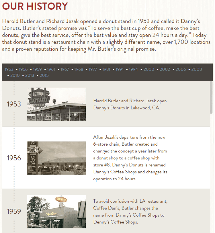
Danny’s gives a short but comprehensive overview of their 62 years of business and spices it up with real pictures of their diners throughout the years. This type of homepage engages visitors and encourages them to buy from a truly American brand which has many years of experience in the food industry.
2. Visual stimulation – A great example of this is a company by the name of ‘Munchery’ which pictures each employee with an object related to one of their own personal hobbies:

This tactic is super whimsical and helps add a personal touch to an otherwise ‘cold’ buying process. Their entire ordering system is online so seeing a friendly face is sure to put shoppers at ease that everyday people like them are running this company. These pictures really help customers build trust and to identify with employees.
3. Value for money – ‘Trader Joe’s’ has actually combined two tactics on their ‘About Us’ page – first they give visitors a nice helping of their narrative and then explain why their product is great value for money:
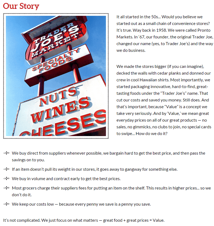
They really hit the value for money home in almost every one of their points below the company’s narrative. They claim to:
- Bargain with suppliers on the consumer’s behalf
- Buy in volume and ahead of time to save consumers money
- Not charge supplier’s fees in order to put food on the shelf thereby saving the consumer money
- Generally keep their costs low in order to retain low consumer prices
All these statements not only exude value for money but also the sentiment that ‘Trader Joe’s’ is in the same boat as the consumer and cares about the customer’s pocket.
4. Social credibility – ‘Alfred’ is a personal assistant of sorts which offers you all kinds of services in order to make your life easier and leave you more time to enjoy yourself. That is why it is important for them to show pictures of real customers enjoying their free time thanks to Alfred’s services:

This picture is very relatable for potential clients who have lots of errands to do and wind up having no time to spend with their pet for example.
5. Call-to-action – The last ‘About Us’ page I want to bring to your attention belongs to Airbnb. Their page does not have a standard call to action but standard is boring so I wouldn’t worry about being out of the ordinary – in many cases this will actually work to your benefit.
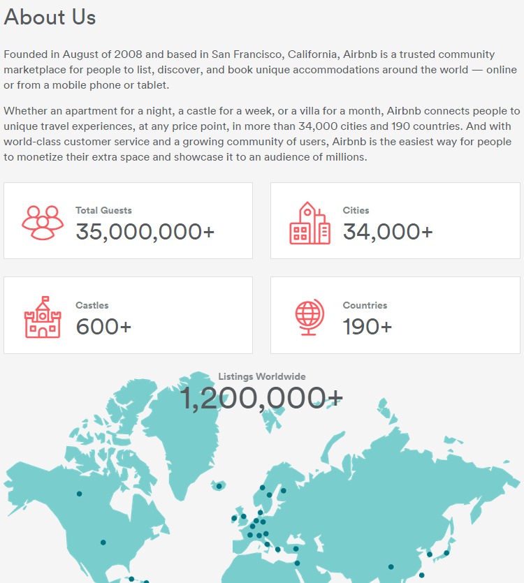
The call to action here is actually brilliantly weaved into the statistics and map that they have created. The numbers alone are enough to spark the imagination of any aspiring world traveler:
- 35 million guests
- 34 thousand cities
- 190 countries
- 1.2 million listings
- And most fantastically 600 + castles
A customer who is even vaguely interested in unique travelling experiences is going to want to immediately check out some of these listings. I personally would start searching for a castle in Scotland to stay in. I am sure you can identify this ‘About Us’ page’s intense call-to-action embedded in its subtext and can appreciate the craftiness of this page’s architect.
‘About Us’ page “generators”
For those of you who are extremely busy and do not have the time to put together an awesome ‘About Us’ page, you always have the option of using an ‘About Us’ “generator”. I put the word “generator” in quotes because no one can really generate content which is tailor-made for your product or company without you doing absolutely nothing. But this option can reduce your involvement and effort greatly. The way I see it, your three main options are:
- Hire a specialist – This is probably the priciest option but also where you will get the best and most high-quality results. In this case, you might want to hire a:
- Content writer
- A graphic designer
- User experience (UX) User Interface (UI) specialist
Depending on how much money you have and how large your company is you may want to hire one or all three of the above mentioned specialists to craft the perfect ‘About Us’ page.
- Use a template – Many eCommerce websites offer ready-made ‘About Us’ templates. One such website is Oberlo which offers a variety of templates. Here are two examples from their site:
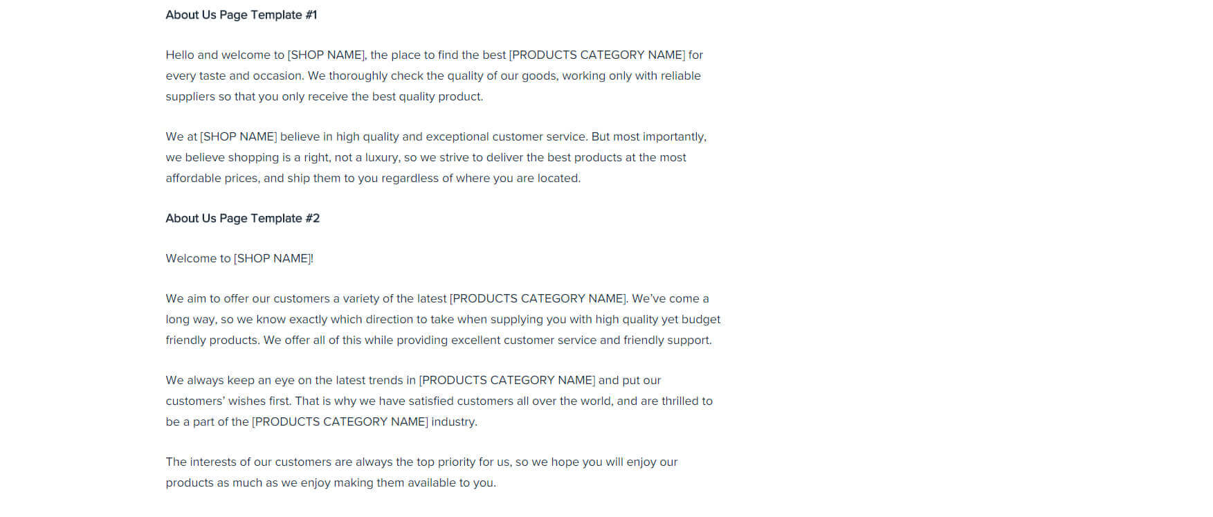
The great thing about templates is that they are usually free and save you a ton of time and money. All you need to do is fill in your specific details and voila – you have an ‘About Us’ page.
3. Freelancer platforms – You can always check out freelancer platforms such as Fiverr which have people who offer to write and/or design your ‘About Us’ page for anywhere from $10-$100:
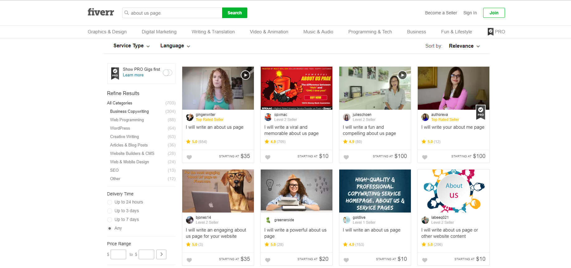
The great thing about these platforms is that they are usually much cheaper than hiring a specialist and more often than not you can get high quality work. Do make sure to check out past examples of jobs freelancers have done and if they are to your liking then give them a try.
Summing it up
At this point you know:
- Why ‘About Us’ pages are important
- What crucial elements to include and focus on
- What to do if you don’t have the time or energy to create a professional ‘About Us’ page
You no longer have an excuse to ignore this aspect of your eCommerce business and why should yyou?If you had a store, you would make sure your sign was beautiful and your shop window perfectly arranged. Take this opportunity to put your best foot forward and greet your virtual shoppers with an extra dose of warmth, a great story and the perfect picture. Create a mesmerizing ‘About Us’ page today and not tomorrow! Please share below your experiences with creating ‘About Us’ pages and how they have helped you generate business. Also feel free to share screenshots of your ‘About Us’ page so that other readers can learn from your successes.


